Today we unveil the Estonian Dialogue Academy’s new visual identity. Over the last six months, we have worked with great passion on this project together with art director Savvas Theodosiou at the Tartu based ‘Purpose-driven design studio’ Orgcaos.
Our goal was to create something that represents the core values of our organisation: empowering people to participate actively in group dialogue, community participation, and public conversation. We wanted more than just a logo or a new website; we aimed for a visual language that is able to carry our message for years to come.
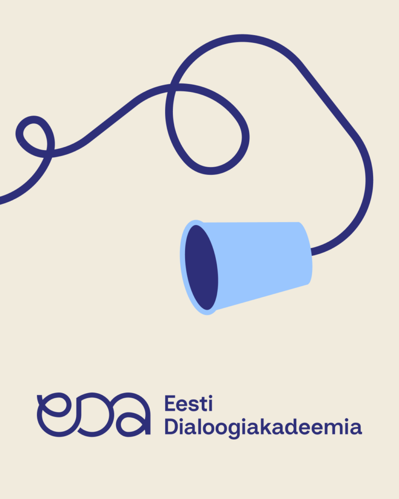
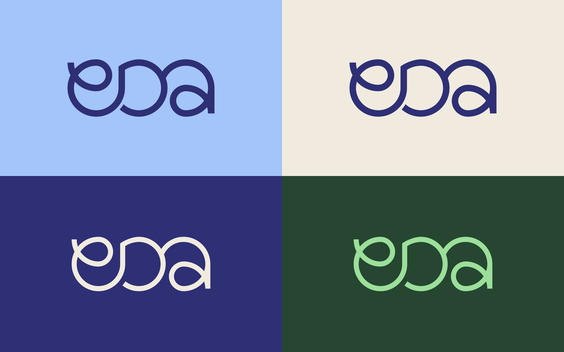
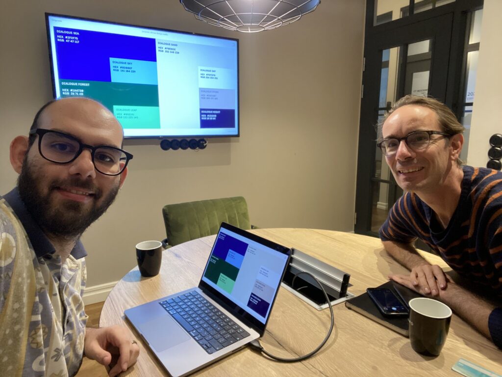
For example, the colours we choose not only represent the sea, sky, sand, stone and forrest in Estonia. They also stand for: exploring with an open mind, striving for clarity in thinking, and finding common ground in conversation. A blue thread binds it all together.
Brand Style Guide
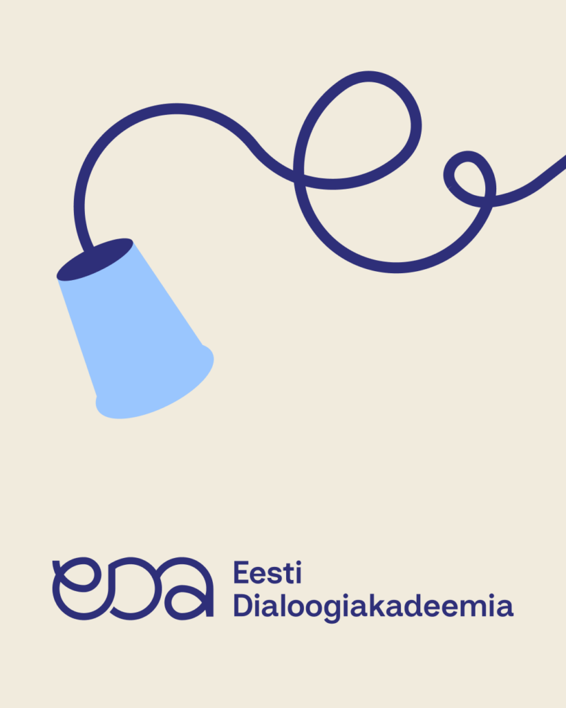
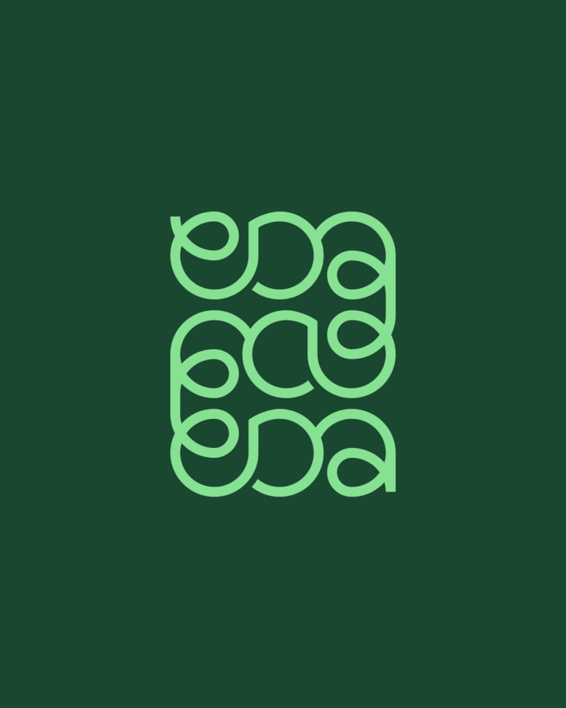
Based on these principles, Orgcaos developed a comprehensive brand style guide for us. This guide will direct the look and feel for all our communications. It includes elements such as brand voice, the main logo in different variants, sub-brand logos for projects, typography, visuals for social media, clothing designs, and templates for presentations and reports.
We are gradually rolling out the new visual identity. For example, we have fully updated our self maintained website based on the brand style guide. New ideas for applications pop up in our minds every day. At the same time, as a NGO, we have to be mindful of our budget and spend it wisely. One of our wishes is to make our website fully bilingual, with all the content in both Estonian and English
Lessons
We learned two important lessons. First, making a great visual identity is not like wrapping paper around what you already do. It involves delving deep into your core values. It is about examining who you believe you are, and who you want to be, as an organisation. Once this is clear, you can start building on it by exploring, testing and brainstorming together. Savvas Theodosiou has been guiding us in every step of that process.
The second lesson we learned is that good, effective, tailor-made visual identities cannot be generated by AI. This is not because you might not like the visuals. But because: 1) you did not undergo a process of self-reflection as an organisation, whether small or large, which included feelings of frustration and disorientation. And 2) you don’t feel ownership of the interaction between your core values and your visual identity. It’s not about how much money you spend; it’s about your commitment to who you are.
We recommend you check out the website of Orgcaos, “a design studio helping purpose-driven brands show up clearly via bold, strategic branding and web design”.
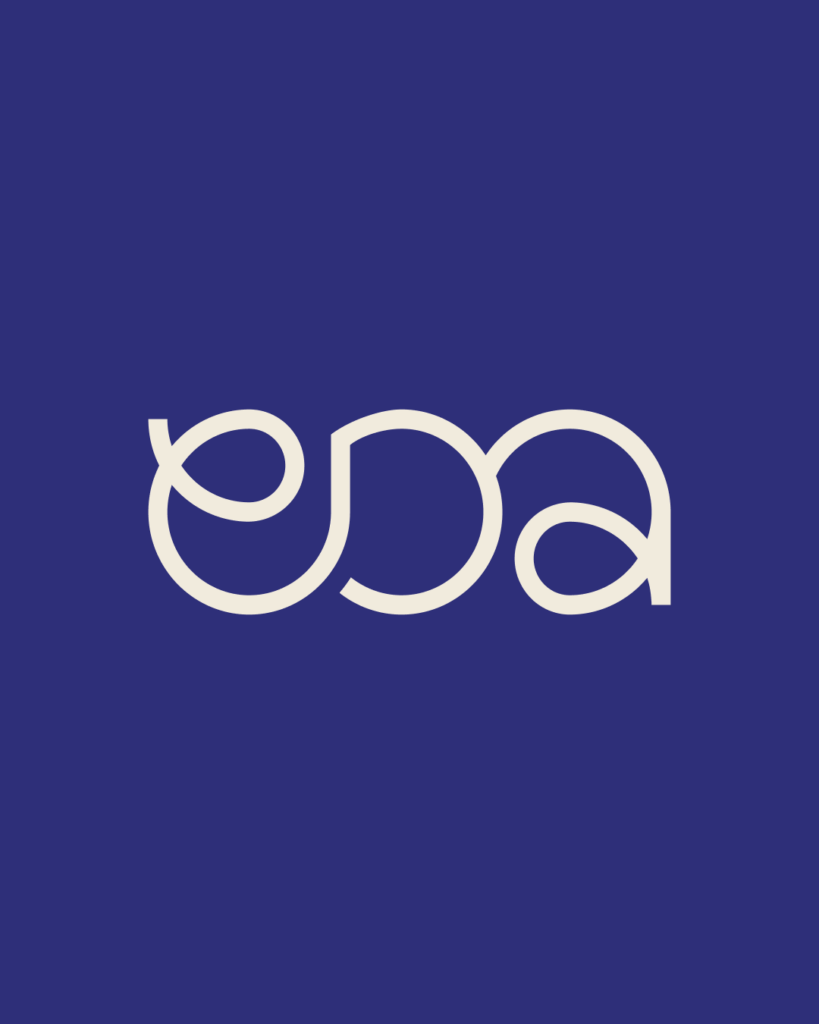
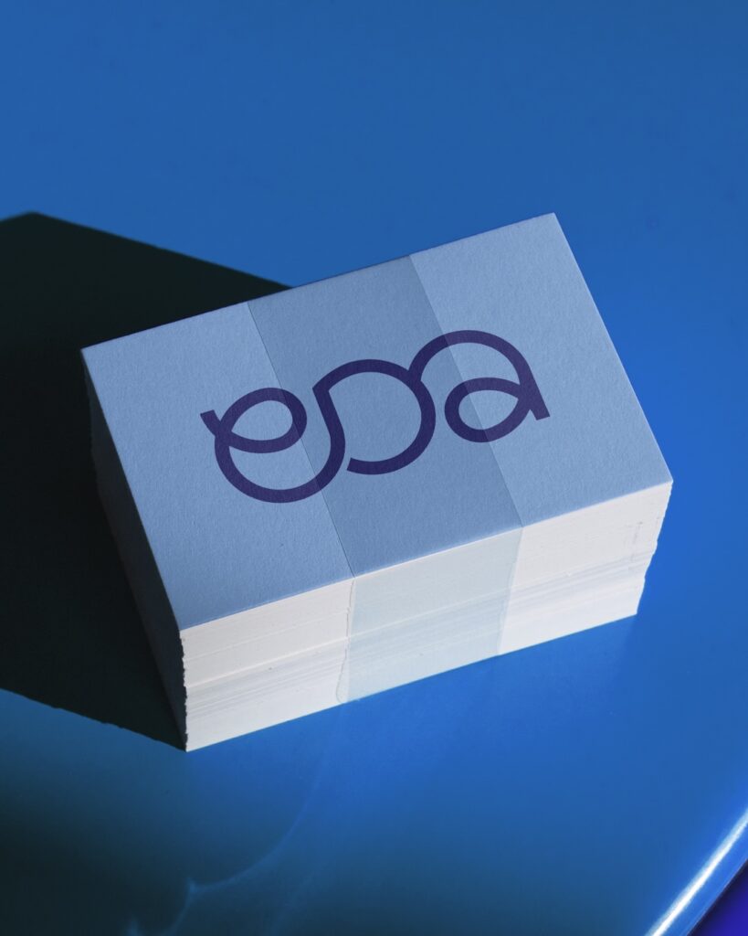
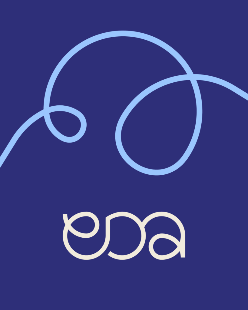
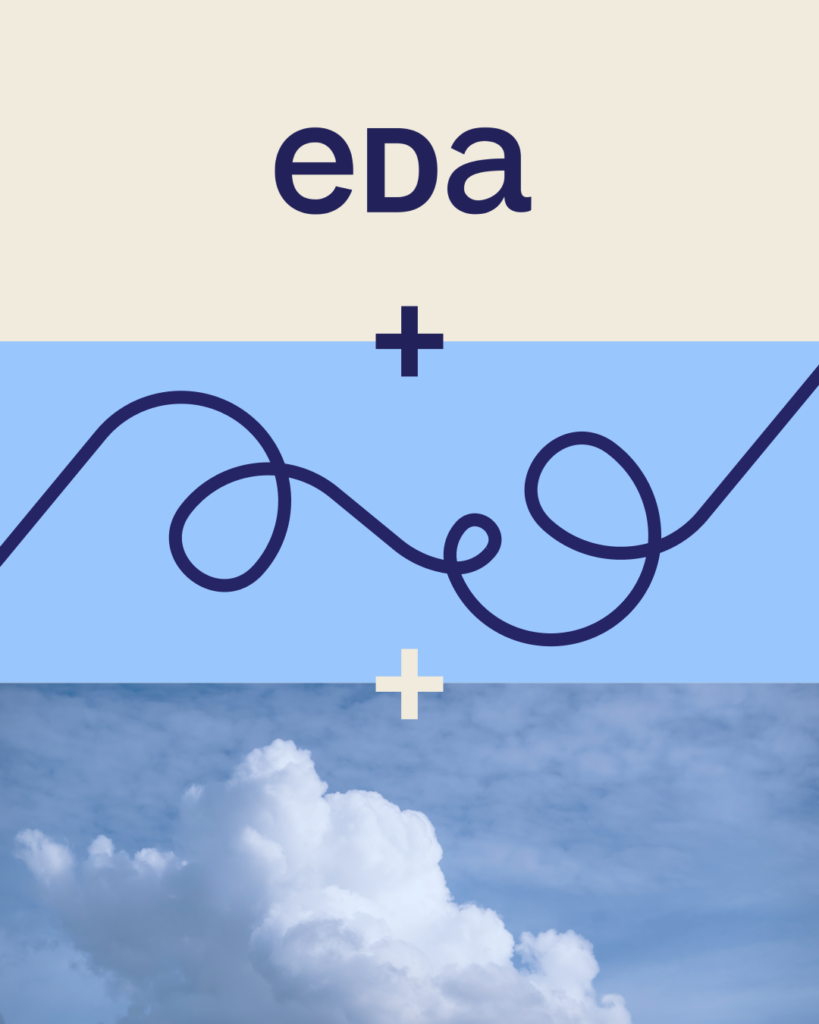
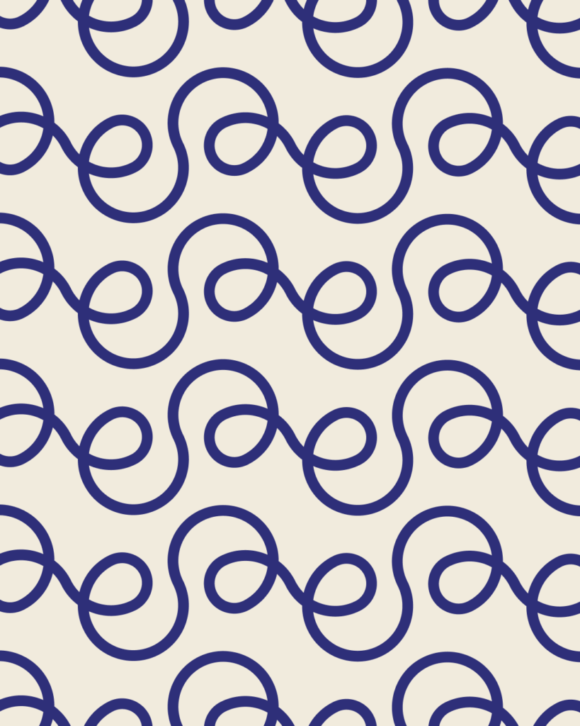
Impressions of new Visual Identity